
June 9, 2014 – one year and 3.5 months ago is when the SPY first hit the number we closed at on Friday. This after a day of selling was unleashed by the nervous-nellies watching every action of the Fed.
It was almost comical to witness the media coverage of the slicing and dicing of each word in the statement – along with the prognosticators attempting to project (read: guess) what the Fed meant by each aforementioned syllable.
All for what? So we can fret over all the same stuff again at the next Fed meeting? Over 25 basis points of interest? Over the job the bond market has already done for the Fed?
If you sense a bit of sarcasm – you are tuned in : )
15.5 Months
We h ave effectively gone nowhere for 15.5 months now. Market participants have raked themselves over this roller-coaster ride process for well over a year now, having spent a bulk of those months in less than a 5% trade range.
On Friday we closed within one percent of the closing price on August 26.
Hence, the point? Well, the point is that so far, the “correction” spanned from roughly August 18 close to the 26th – of August. The rest of the time has been spent in yet a new trade range.
Yes, more sarcasm. Is there a retest in the cards? Pray for it.
Why?
Well the review of a few charts from Calafia Beach always helps temper the nerves – and the urge to leap from the nearest window ledge.
In a nutshell – the worl d is not ending.
By the way, just for grins, since the date noted in the opening of this morning’s note to you (June 9, 2014), the world has not ended. In that time however, the following order of disasters grabbed our focus as the world-ending-event-of-the-week contest winner:
Ebola, Greece, Bird-Flu, Greece, Greece and China.
Next?
We surely know by now from all of our collective chats together that bad news seems more prone to get the headlines, whereas there’s a lot of good news that goes largely unnoticed.
We have covered a few examples herein with some help from the great charts from Calafia. The bad news can be recited in your sleep by now I suppose.
Sure, it can be adjusted here and there from state to state but the gene ral theme is clear:
This is the weakest recovery ever; the labor force participation rate has been falling for 15 years; productivity growth is dismally low; our national debt is at a post-war high of 72% of GDP; race relations have deteriorated; tax and regulatory burdens are suffocating the private sector; savers and retirees have been severely penalized by seven years of near-zero interest rates; the rule of law has been weakened by the emergence of the Imperial Presidency; crony capitalism (a euphemism for corruption in government) is rampant; the tax code is a nightmare; and transfer payments are at record-high levels that correspond to 20% of personal income and over 70% of federal spending.
(Note: several of these themes – and the fixing thereof – are likely to become heated topics during the upcoming year-long campaign for President) By the way, markets like those promises from new administrations.
Good news?
Is there any you might be wondering? One would assume not when listening to any media.
Ahh, yes – but there is:
Despite all the bad news, household net worth is at an all-time high ($85.7 trillion), whether measured in nominal, real or per capita terms; households’ leverage has fallen by more than 30% since the 2009 peak; the economy has been growing and jobs have been expanding for more than six years; 30-year fixed mortgage rates are 3.84%, only 40 bps higher than their all-time lows of 2012; housing starts have increased by an annualized 15% rate for the past six years; the private sector has created over 4 million net new jobs since 2007; inflation has averaged only 2% for the past 10 years; and the dollar is still one of the world’s strongest currencies.
Here are some of those promised charts pasted in below which incorporate the latest data on Q2/15 household net worth released late last week:
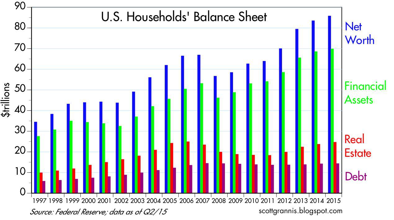
Note that household net worth has reached an astounding $85.7 trillion.
That represents an increase of almost 30% ($18.9 trillion) from the pre-recession levels of 2007. The increase was driven by a $16.7 trillion increase in financial assets, and it occurred – in a very healthy fashion – alongside a modest reduction in liabilities.
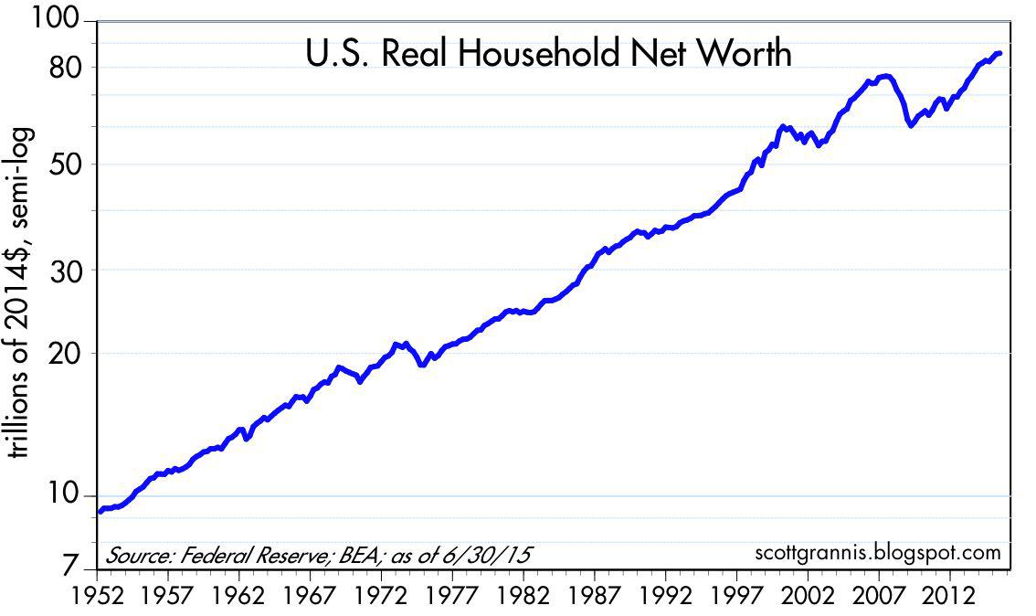
After adjusting for inflation, household net worth now stands at a new, all-time high.
That continues the long-term trend of annualized increases of almost 2.5% in real household net worth.
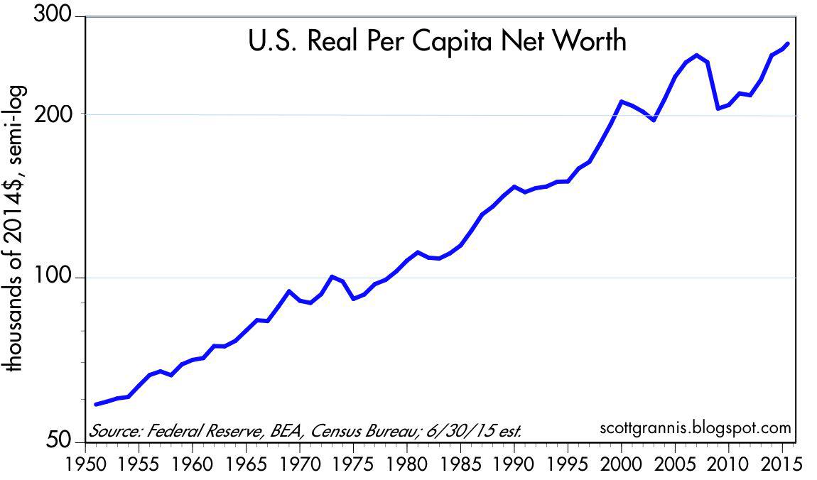
After adjusting for inflation and p opulation growth, real per capita net worth is also at a new, all-time high of about $268K.
Even if all this staggering amount of wealth were held by just a handful of people, it would still be the case that we all benefit from it. This wealth is the ultimate source of all jobs and our living standards.
Because our economy can produce so much, so efficiently, the fruits of modern life (e.g., iPhones, air travel, clean water, abundant food) are available to virtually everyone. This is unequivocally good news.
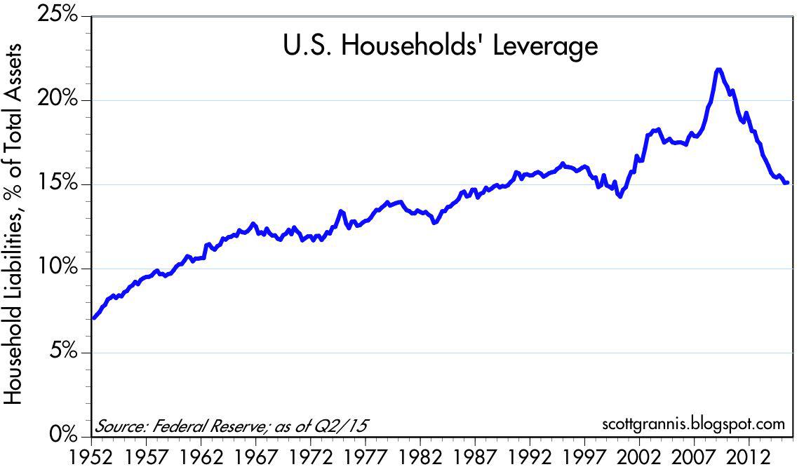
As the chart above shows, all of the wealth gains have occurred against a huge – and very beneficial – backdrop of pronounced deleveraging on the part of the household sector.
Leverage has been rolled back to the levels of the mid-1980s.
Who says that deleveraging is bad for growth and prosperity?
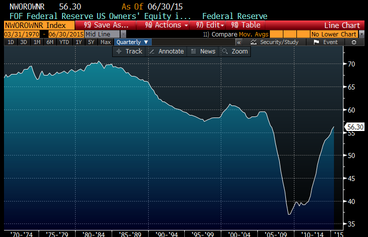
The chart above shows the Fed’s calculation of the average homeowner’s percentage equity ownership in his or her home.
Although still relatively low from a long-term historical perspective (it was over 80% in the early 1950s), it has re bounded significantly in the past six years.
Households’ real estate holdings today have just about regained their prior peak levels of 2006.
Now, you must admit – that all sounds a tiny biut better than the wave after wave of begative headlines right?
The Better News?
The biggest wave of all is just beginning to tickle the edges of the US economy. Use red ink as your friend.
Be patient – it could remain cloudy while the crowd frets over the next Fed meeting.
Just recall that all the fretting in the short run provides long-term investors a nice window to patiently buy things on the cheap.
As covered last week – years and years from now, finding the “China Syndrome” on a map will be as tough as it is today to see the Great Depression on a stock chart – or the Crash of 1987.
Think: patience, long-term, steady as she goes, disciplined.

