
Needless to say, while the Holiday Season is unfolding nicely, the markets continue onward with the internal churn we have lived with all year – and then some. This week alone we have seen each day move more than 100 points – in different directions….and we are down a percent. Last week we were up a percent.
Today, we I send this note out, we stand at the same prices seen back in late October.
The fears remain deep and widespread. If it is not the Eurozone today, it will be tomorrow. Likewise for China, interest rates, currency wars, terrorism, inflation, deflation, Brazil, debt bombs, etc., etc., etc.
The gold bugs continue to wonder where inflation is – as we continue to suggest we should fear deflation more if you need to fear something.
The latter is far more difficult to fix but is being driven by massive improvements in productivity, tech tools, the cloud and the internet finally beginning to impact the world as was expected back in the tech bubble 15 years ago.
A little early maybe – but not wrong in the end.
New Problems
Of course, now that all things internet are delivering as expected, they have become the new problem.
While we “lose” dollars in one column of the Holiday Season sales analysis, we are gaining 6 times that amount in another. Were I being tested in math class and answered that sales were down overall – I would fail.
Alas, the magic potion of experts and media churn produces negatives even out of positives. As I noted earlier, little has changed this year on some fronts.
While jobs came in solid and lay offs are at 9-month lows, we can be assured that before you get this, there will be bad news made of this by someone. Incomes are good, savings are good, cash levels are high, margins are steady.
Earnings season is basically behind us – and if we take out the energy sector, the rest of the market kept growing (charts below from Calafia).
Politics will take more and more center stage attention as the New Year dawns – we desperately need new blood in DC. The lack of any input from our President this year has been obvious for all to see. Maybe he forgot that he actually had to serve 8 full years?
In any event, I will hold those punches as previous writings on the topic ended up being far too correct for my taste – sadly. An embarrassment he has been indeed.
Business Needs
In the election climate of 2016, expect to hear more and more pressure on taxes – they have become a major headwind and are indeed one cause of not having even more jobs to fill.
Take the head pain away from business and we will see our “sub par recovery” burst into a new gear – and millions more will be happy.
Along with that, oddly, the government would find that its revenues actually increase. Where is President Reagan when you need him huh?
It’s Friday
A few more weeks until Christmas and Hanukkah celebrations. Expect volumes to begin to dry up again in another week or two as most will lock things up and focus instead on maybe (hopefully) a less choppy 2016.
Before we say goodbye to this week and the generally positive data backdrop, let’s send you off with some charts to glance over. They are f rom the great people at Calafia and provide a solid footing to the fear that markets are “overvalued.”
I am reminded of the days in my early years where I often heard, “Mike, do you really want me to invest in DOW 1140 when it has never traded there before?”
I rest my case.
Cheer up guys – the churn is a sign that a breakout awaits. Unfortunately that requires that all too hated word – p.a.t.i.e.n.c.e.
Have a great weekend….let’s get to those charts now
More on the Latest GDP Revisions
With last week’s release of revised GDP statistics for Q3 2015, we learned that after-tax corporate profits in the third quarter were down 3.2% from the second quarter (if we include energy), but were up 1.4% from y ear-ago levels.
Growth in profits has slowed significantly in recent years, but profits were still 9.9% of nominal GDP last quarter, just shy of their all-time high of 10.8%, which was set three-and-a-half years ago.
To put that in perspective, we are reminded to consider that after-tax corporate profits have averaged about 6.5% of nominal GDP since 1959, and as recently as 11 years ago, profits had never exceeded 8% of GDP.
At a time when corporate profits have been unusually strong relative to nominal GDP, it is worth noting that investors’ valuation of those profits (i.e., how much they are willing to pay per dollar of profits) is only about average, according to a variety of measures detailed below. Current valuations thus appear to incorporate a substantial amount of skepticism about future profits.
Put another way, there is no evidence here that equity valuations are in “bubble” territory.
Instead, it would appear that the market is priced to the expectation that corporate profits will sooner or later regress to their long-term mean – which would, in turn, imply years of no growth or declining profits.
But, as I’ve also noted that remains in my opinion an overly pessimistic view, given that corporate profits today are about average when compared to global GDP.

The chart above shows two versions of after-t ax corporate profits: one, a comprehensive measure compiled by the National Income and Product Accounts (aka the GDP stats), and the other the earnings per share of the S&P 500 companies.
Both are close to all-time highs, and both have increased by roughly the same order of magnitude over the past 5-6 decades.
Both show relatively slow growth of late but by and large they are telling the same story.
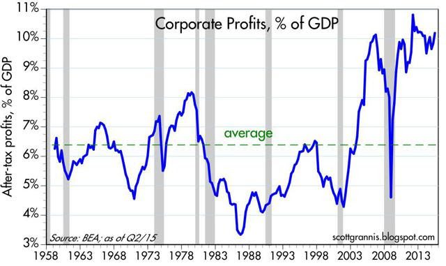
The chart above compares the NIPA measure of after-tax corporate profits to nominal GDP. This has averaged about 6.5% since the 1950’s, but for the past several years it has been significantly higher.
Is this series mean-reverting? That is the question investors have been asking themselves for years. Many worry that it is. That worry is good.
It has produced $8 trillion in idle assets in bank accounts – waiting to be spent.

I’ve been noting for years (along with Dr. Ed’s helpful data) that corporate profits relative to GDP are not necessarily going to revert to their historical mean of 6.5% because of globalization.
Major U.S. companies now earn a substantial portion of their profits overseas, and overseas markets have grown much faster than the U.S. market (think China and India). When profits are measured relative to global GDP (see chart above) they are only slightly above their long-term average.

One traditional measure of valuation is the ratio of equity prices to earnings, shown in the chart above. Here we see that current P/E ratios of 18.6 (according to Bloomberg) are only moderately above their long-term average of 16.7.
Valuations today aren’t even close to what they were in 2000, when we now know stocks were in “bubble” territory.

The chart above is Calafia’s version of P/E ratios:
It uses the S&P 500 index as a proxy for the price of all companies, and it uses the NIPA measure of after-tax profits as the “E.” I’ve normalized the series so that its long-term average is similar to the standard P/E measure shown in the previous chart. Here again we see that valuations today are about average.
The market is not very enthusiastic about the prospects for growth and profits, and that’s why equity valuations today are merely average. It’s a cautious market, not an irrationally exuberant market. But, on the margin, real yields and P/E ratios have been moving higher; the market is becoming less risk-averse as confidence slowly returns.

Caution is also reflected in the chart above, which shows the difference between the earnings yield on stocks (the inverse of P/E ratios) and the yield on 10-year Treasuries. In order to satisfy investors’ aversion to risk, the market demands a yield on stocks that is about 4% higher than the yield on safe Treasuries. Today’s equity risk premium is substantially higher than its long-term average .

The chart above compares the earnings yield on stocks with the yield on BAA corporate bonds (a proxy for the typical large company that issues bonds). Finance theory would say that in “normal” times the yield on a company’s bonds should be higher than the yield on its equity.
That’s because the potential return to owning corporate bonds is limited to their coupon, whereas the potential return to owning stock is theoretically unlimited, since earnings can grow significantly over time. Investors should be willing to pay a higher price for the stock (and consequently accept a lower yield) than for a bond of the same company.
Today bond yields and earnings yields are about the same. For the same price as a bond, equity investors get much more upside potential; that in turn implies that equity investors don’t see much upside potential-if any-to corporate earnings.

The chart above illustrates one simple rule of thumb which attempts to reveal whether stocks are over- or under-valued, or just about right.
The Rule of 20 says that the stock market is fairly valued when the sum of the average price-earnings ratio and the rate of inflation is equal to 20. Above that level, stocks begin to get expensive; below it, they’re bargains. In the chart I’ve added together the EPS of the S&P 500 and the year over year rate of inflation according to the core PCE deflator, the Fed’s preferred measure of inflation. The sum today is just about exactly 20 (18.6 + 1.3), which puts equity valuation squarely in “average” territory.
In Summary for Thought
There is a common theme to the charts and discussion above.
Stocks are not obviously over-priced or under-priced. Valuations are likely in the range of what a conservative investor might call “reasonable.”
Relax – embrace the chop and angst – it means better elements await the patient and disciplined, long-term investor….even when allow ing for how ugly it feels sometimes in the near-term.
Hope the chart additions were not too much – provides for a nice weekend review between shopping trips.
I look forward to seeing you in line somewhere : )

