
Nothing like a few headlines to mess up your day right?
I mean we were told all was going to hell in a handbasket. We were told the end was nigh. We were told the US could never recover. We were told QE was the end of all things. We were told Gold was all we needed – or should ever invest in.
Since 3008 and 2009, Wall Street has created literally hundreds of “tools” to help people “hedge” their risk. Wall Street did it so well that they have been found as the reason for city budgets to run blood red and some countries to literally go broke.
And one wonders why all these n ewfangled tools to hedge risk have done little more than simply lose money one could have kept.
Once again, history has born out as it always has – when risk is truly high, no one cares about it – it all just feels too good and things are perceived as going too well.
Today we have the opposite….to levels of extremes I can admit not having experienced before. I cannot have a conversation about investing without some mention of this basic theme: “Yes, but what to we do when we get another 40% correction.”
It is not just the certainty in the manner in which the question is posed these days – but the tone. It is a tone of defeat – as though it is not only certain but we are all sure to be hurt by it.
That is no way to invest for the long-haul.
Let Me Explain
I will provide you a snapshot – a few facts and a chart or two (or 5):
Nearly $8 Trillion dollars is sitting idle in personal bank accounts
Equity Fund investors are net sellers in 2015 YTD
Bond Funds continue to receive waves of cash
In the below chart, you can see the 8-week moving average of bulls in the latest AAII survey shows massive in-bred fear – harkening back to levels seen at important lows in history – 2003 and 2009 to be more current. Further, the latest data show we are a mere 2 percentage points away from levels seen in the 80’s – when the DOW was only 16,000 points lower!

Do we really believe that the world ahead is equivalent to what we perceived was ahead over 35 years ago?
In a word – preposterous.
Yet, the Data Speak Volumes of Difference
Don’t take this as callous as I surely respect what fear has done to investor psyche over the last 15 years.
However, we are reaching levels of absurdity that border on blindness. The data – the results, the real world events simply have little attachment to the issues I hear being expressed.
The market – the idea of investing – has been turned into more of a computer game with lights and bells and whistles….replacing logic and thinking.
Just this week, I witnessed several stocks with staggering beats on earnings – get clocked. Why? Because the “guidance was weak” – combined with high speed trading antics and idiots on trading desks while the first stringers are away for summer vacations.
In two events, earnings were up over 100% year over year – beating “expectations” by over 30% in one case.
However, because the big beat had likely borrowed from the next quarter by 3 cents (less than 1% of the number in question), the stock sold off by 19%.
In other words, a company that is earning far more than was expected before the earnings report – even after “weak guidance” – had hundreds of millions of dollars in value erased?
Sound smart to you?
Yet while all this fear is being successfully generated…what happened?
You Won’t See These Headline s
ISM Manufacturing numbers beat guidance
ISM service numbers hit 10-year highs today!
Leading Economic Indicators are hugging a line they have hugged for years – a good thing
Durable Goods Orders Up
Housing Starts Up
Jobless claims hugging multi-year lows
Profits (though hitting a growth rate lull masked by the oil sector calamity) are at all-time highs – again.
Cash flows – all-time highs
Dividends – all-time highs
Friends Listen…
When you witness insanity like this – with fear riddled sentiment actions and trillions of cash sitting idle, one has only two steps to focus upon: be patient (grin and bear it) and take advantage of these ridiculous reactions when you can…and then institute an even higher level of patience as the chop subsides – and it will.
And Now For Those Pictures I promised…
You know the charts Scott Grannis does are always really good so I have included a few here for you with notes.
The bottom line?
Things are actually getting better – not worse.
Even though the headlines will never tell us that…read on

Back in 1982, I could have purchased gold at $450 an ounce or the DOW at 970.
Which one kept up with inflation better?
Even with all the calamities and disasters of the last 30+ years included?
That noted, the chart above shows gold continues to decline, and the price of 5-yr TIPS continues to fall (note that the chart uses the inverse of the real yield as a proxy for price). Both of these assets are unique, and both offer protections and safety that can’t be found in other assets.
These assets were extremely expensive not too long ago, when the world was afraid of another financial market collapse following in the wake of the PIIGS crisis.
Now, despite the problems of Greece and the slowdown of the Chinese economy, demand for the unique “safety” provided by gold and TIPS is declining.
Why? Because the future today doesn’t look as bad as it did a few years ago. Inflation has remained low; the dollar hasn’t collapsed, it’s actually strengthened – as can be seen below:
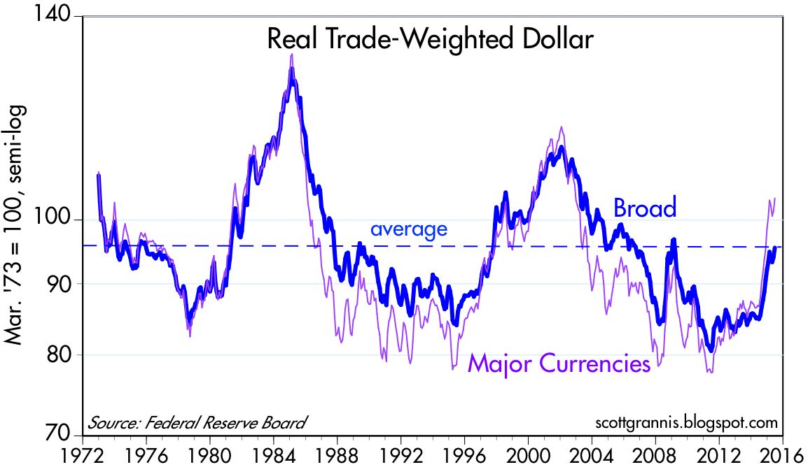
The dollar’s sharp rise over the past year has only managed to return it to what you might call an “average” level against the world’s currencies.
The dollar was extremely weak a few years ago, as the world worried that the U.S. would rack up trillion-dollar deficits for as far as the eye could see that would in the end result in a serious debasement of the currency.
But instead, the federal deficit today is less than 3% of GDP, and the burden of federal debt has stopped rising.
The dollar is not up because the Fed is going to tighten, it’s up because the U.S. economy is now more attractive compared to other economies, and because the Fed has done a decent job of managing monetary policy.

At the end of the day, it should also not be surprising that the growth of money closely tracks the growth of nominal GDP, as the chart above shows.
On average, and over many decades, a dollar of new money translates into a $1.75 of new nominal GDP.
However, over the past decade we’ve seen that money growth has far exceeded the growth of nominal GDP – see below:

As fear mounts – the demand for money increases – remember – we had $ 1.3 trillion in bank accounts at the end of the tech bubble crash in 2003. Today – we have just a shade under $8 Trillion. It’s called f.e.a.r.
Money growth that exceeds nominal GDP growth means that the world’s demand for money has increased, as the chart above shows. People want to hold a greater portion of their incomes and their wealth in money and savings accounts.
Why? Because they worry.
The demand for money has been extremely strong, but it is becoming less strong.
As a result, it’s reasonable to think that nominal GDP will, over the next several years, likely begin “catching up” to the ongoing rise in M2.
There’s a lot of money that has been socked away that could begin circulating, boosting both prices and the overall level of economic activity. All it takes is more confidence in the future.
In other words, as the masses become more comfortable taking the risk that the future will be better – the future indeed will be better. Strange right?
In short, the world is flush with money—trillions of the stuff—but the demand for all that money is beginning to weaken. That’s why the Fed needs to raise short-term interest rates.
The Fed needs to make bank reserves more attractive, on a risk-adjusted basis, relative to lending money to businesses. Otherwise the world might find itself awash in liquidity that no one wants, and that’s the fundamental recipe for higher inflation.
Ah, but shouldn’t the Fed worry that inflation is too low? No, because it’s not…unless you get sucked in by headlines written by those who have never been even remotely related to economics training.
See below:

So What’s Next?
When we began the summer we suggested it would chop churn. We hoped for a swoon – the internal churn is providing the swoon but the averages are indeed going nowhere. As Memorial Day arrived, the SPY spent the week prior between 212.00 and 209.75. As I type these notes for you, the SPY is 210.33. It has been 2% lower and 1.2% higher since May 30.
Stay focused on what’s next – and what’s next is bigger than we have ever seen in the US economy.
Setbacks are your friend…don’t be afraid when stocks are on sale.
Stay focused on the long-term.

